• A new LGBTQ+ forum is now being trialed and there have been changes made to the Support and Advice forum. To read more about these updates, click here.
  • Hey Trainers! Be sure to check out Corsola Beach, our newest section on the forums, in partnership with our friends at Corsola Cove! At the Beach, you can discuss the competitive side of the games, post your favorite Pokemon memes, and connect with other Pokemon creators!
  • Due to the recent changes with Twitter's API, it is no longer possible for Bulbagarden forum users to login via their Twitter account. If you signed up to Bulbagarden via Twitter and do not have another way to login, please contact us here with your Twitter username so that we can get you sorted.

Player Characters Discussion

The new human models makes me terrified of any future character cameo's now. Sadly i doubt Gamefreak will revert to the old style despite it being much better so we gotta get used to humans like this. Hopefully they can improve it some because honestly these faces just seem like they would be less expressive.
 
The new human models makes me terrified of any future character cameo's now. Sadly i doubt Gamefreak will revert to the old style despite it being much better so we gotta get used to humans like this. Hopefully they can improve it some because honestly these faces just seem like they would be less expressive.
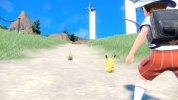
Can it get any worse than this?
8BB804D6-4D2B-4CAA-AE14-139A44DBD323.jpeg
 
The discussion surrounding the character faces reminds me of the transition between Gen IV and Gen V and the fan reactions to their faces. It’s still too early to tell how much different this generation of characters will look from previous gens, but it is an interesting parallel to note.
 
The diffrence between Gens 4 and 5 was obviously art style upgrade. It really wasn't as big as this in retrospect.

I mean it's pretty obvious that someone else other than Sugimori or the other usual character designers came up with the inital designs this time around.
 
I JUST noticed this now. Take a look at this picture of the male character:

1646668351411.png

There seems to be something on the right sleeve. It's also on the sleeve of the female character. What do you guys think it is? It looks like a patch or logo, like how our character in Legends Arceus has the Galaxy symbol/logo on the sleeve of their survey uniform.
 
I JUST noticed this now. Take a look at this picture of the male character:

View attachment 156721
There seems to be something on the right sleeve. It's also on the sleeve of the female character. What do you guys think it is? It looks like a patch or logo, like how our character in Legends Arceus has the Galaxy symbol/logo on the sleeve of their survey uniform.
It's just the school emblem we saw by the door in the live action part of the trailer as well as the girl's backpack.

There's nothing really secretive about what they're wearing other than why there's two diffrent uniforms and fruit emblems.
 
It's just the school emblem we saw by the door in the live action part of the trailer as well as the girl's backpack.

There's nothing really secretive about what they're wearing other than why there's two diffrent uniforms and fruit emblems.
I see. I wasn't sure if anyone had noticed that detail yet.
 
Last edited:
I think the only thing i don't like about customization is that it caused whoever Gamefreak that designs the player characters to stop trying as hard as they used to because they know people can just change the character's clothes.

It's just an assumption on my part, but since XY it feels like they just make their designs more and more basic, so that it incentives people to change their clothes to something that actually looks cool. I guess this is fine, but makes me miss the older designs that were more elaborate.
 
That was kind of the first thing people noticed. Especially here:
View attachment 156732
I am not surprised that I missed that when I watched the trailer. Small things like that tend to go unnoticed (at least for me). I did see the two crests at the end of the trailer, though they were more obvious than the little patch/logo/whatever on the character's sleeve.
 
I think the only thing i don't like about customization is that it caused whoever Gamefreak that designs the player characters to stop trying as hard as they used to because they know people can just change the character's clothes.

It's just an assumption on my part, but since XY it feels like they just make their designs more and more basic, so that it incentives people to change their clothes to something that actually looks cool. I guess this is fine, but makes me miss the older designs that were more elaborate.
I actually thought Serena, Seline II, Elio I, Gloria, and Victor had pretty okay defaults. These protags are the first major screw ups if the, to paraphrase one of the many upset Japanese players, Oh Mikey-looking models don't change.

Like I don't care about the gender neutral school uniforms or them actually looking like the children that they are...I'm still not over their horrible sewer gremiln faces. They don't match the previous main series characters at all. Every time I think I've warmed up to the art...I remember the models.

I am not surprised that I missed that when I watched the trailer. Small things like that tend to go unnoticed (at least for me). I did see the two crests at the end of the trailer, though they were more obvious than the little patch/logo/whatever on the character's sleeve.
It did go by pretty fast. All things considered. I doubt anyone would have noticed if everybody and their brother didn't comb through the trailer frame by frame looking for hidden things.
 
Last edited:
My opinions on them:
I feel mix on them as a whole. They look much younger than previous protagonists and I hate the hair on the male protagonist, I haven't been liking the male designs since Ultra Sun/Moon. Plus I really seem unsure on the whole school uniform aesthetic especially the hat since it reminds me of a uniform Japanese elementary school children. I just hope we get to customized outfits as soon as possible since I am really unsure about these designs.

- I already said something close to another topic, but it doesn't hurt to repeat.

- I don't think the character designs are bad per se, they seem, in general, to be quite believable and even cute designs. However, with regard to the male character, that hat looks odd and out of place. What really bothers me, as an "old man", is that the characters' models look younger than the ones in Sworld/Shield, which, for me, is a negative aspect.

- Obs: I find the designs of the Sun and Moon protagonists to be the most generic and worst possible. Just my opinion, anyway.
 
Last edited:
- I already said something close to another topic, but it doesn't hurt to repeat.

- I don't think the character designs are bad per se, they seem, in general, to be quite believable and even cute designs. However, with regard to the male character, that hat looks odd and out of place. What really bothers me, as an "old man", is that the characters' models look younger than the ones in Sworld/Shield, which, for me, is a negative aspect.

- Obs: I find the designs of the Sun and Moon protagonists to be the most generic and worst possible. Just my opinion, anyway.
I agree so much! It just looks like a circle stuck behind his head. The girl's is bad took but at least looks like it has a shape.

I think they did that with Lillie's official art, too. You see the wide brim, but can't tell what the hat is like other than the fact that it has a wide brim.

I'm not sure there's a good solution to this other than drawing from a different angle or just using a different hat.
 
These are the most horribly designed human characters I've ever seen in Pokémon.
I blame it on the eyes. What was wrong with the designs we've had since Gen... 4? or is it 3? But I liked the more oval anime eyes.
The new PCs look awful especially in-game. Do not want -100000/10
 
These are the most horribly designed human characters I've ever seen in Pokémon.
I blame it on the eyes. What was wrong with the designs we've had since Gen... 4? or is it 3? But I liked the more oval anime eyes.
The new PCs look awful especially in-game. Do not want -100000/10
I assume they saw how successful New Pokemon Snap was and thought it was because of the character design :p
I joke
 
i dont think the new player characters look that bad, actually. they definetly look younger, which im sure will be upsetting to some people (pokemon is like, almost 30 years old now), but they still look fine. simple, yes, but considering this game will definetly have a school setting, i dont imagine they could do very much with the default uniforms. theyre very cute character designs.

but what do i know. im an 18 y/o stuck with a 12 y/o baby face, of course im going to like the player characters that look the most like me...
 
In my opinion character design is bland and not as expressive as Sugimori's but that's not even my biggest gripe. My biggest gripe is lack of cel-shaded graphics. Don't you guys see how badly pokemon models which still use cartoonish designs clash with washed out, overly realistic graphics? I played ORAS not long ago, and man, those graphics popped compared to SV. Yes, they were simpler but they were fitting the Pokemon aesthetic. Something tells me GF tries (and fails) to turn mainline Pokemon into some Go hybrid with those overly realistic graphics. That's also the reason for overly cutesy and 'safe' designs and decline of evil teams - they want to leave anime roots behind and become all-encompassing children-oriented franchise. A shame, because I liked Pokemon exactly for Sugimori's cool and edgy style
fc99bdc0-s.jpg
 
In my opinion character design is bland and not as expressive as Sugimori's but that's not even my biggest gripe. My biggest gripe is lack of cel-shaded graphics. Don't you guys see how badly pokemon models which still use cartoonish designs clash with washed out, overly realistic graphics? I played ORAS not long ago, and man, those graphics popped compared to SV. Yes, they were simpler but they were fitting the Pokemon aesthetic. Something tells me GF tries (and fails) to turn mainline Pokemon into some Go hybrid with those overly realistic graphics. That's also the reason for overly cutesy and 'safe' designs and decline of evil teams - they want to leave anime roots behind and become all-encompassing children-oriented franchise. A shame, because I liked Pokemon exactly for Sugimori's cool and edgy style
I don't think that the design is becoming "less edgy" as time goes on considering how Archie looks in AS and a lot of the character design in SM in general. I think the reason for changing the art style is to show how the franchise is evolving with SV, though I think they did a poor job. You can't have Pokemon without it's iconic art style imo.
 
Please note: The thread is from 2 years ago.
Please take the age of this thread into consideration in writing your reply. Depending on what exactly you wanted to say, you may want to consider if it would be better to post a new thread instead.
Back
Top Bottom